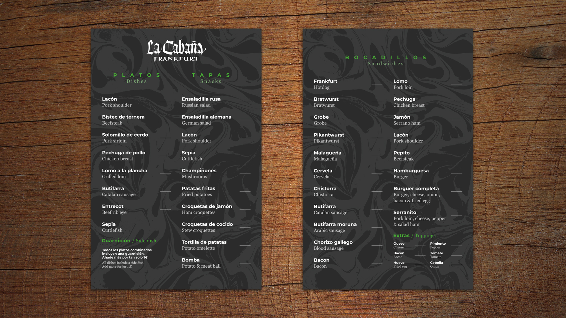
La Cabaña logotype
When asked to refresh a logo for your favorite bartender or trusted restaurant, the only way to do it is by having fun. La Cabaña is the classic Frankfurt located on Roger de Flor / Diputació square. It has been there since 1973, attracting new customers while remaining a favorite for those who have been visiting since its opening. You won't find fancy food or high prices. Instead, you'll discover frankfurters, burgers, and a mix of local dishes, all served in a cozy space with good-humored waiters.

>
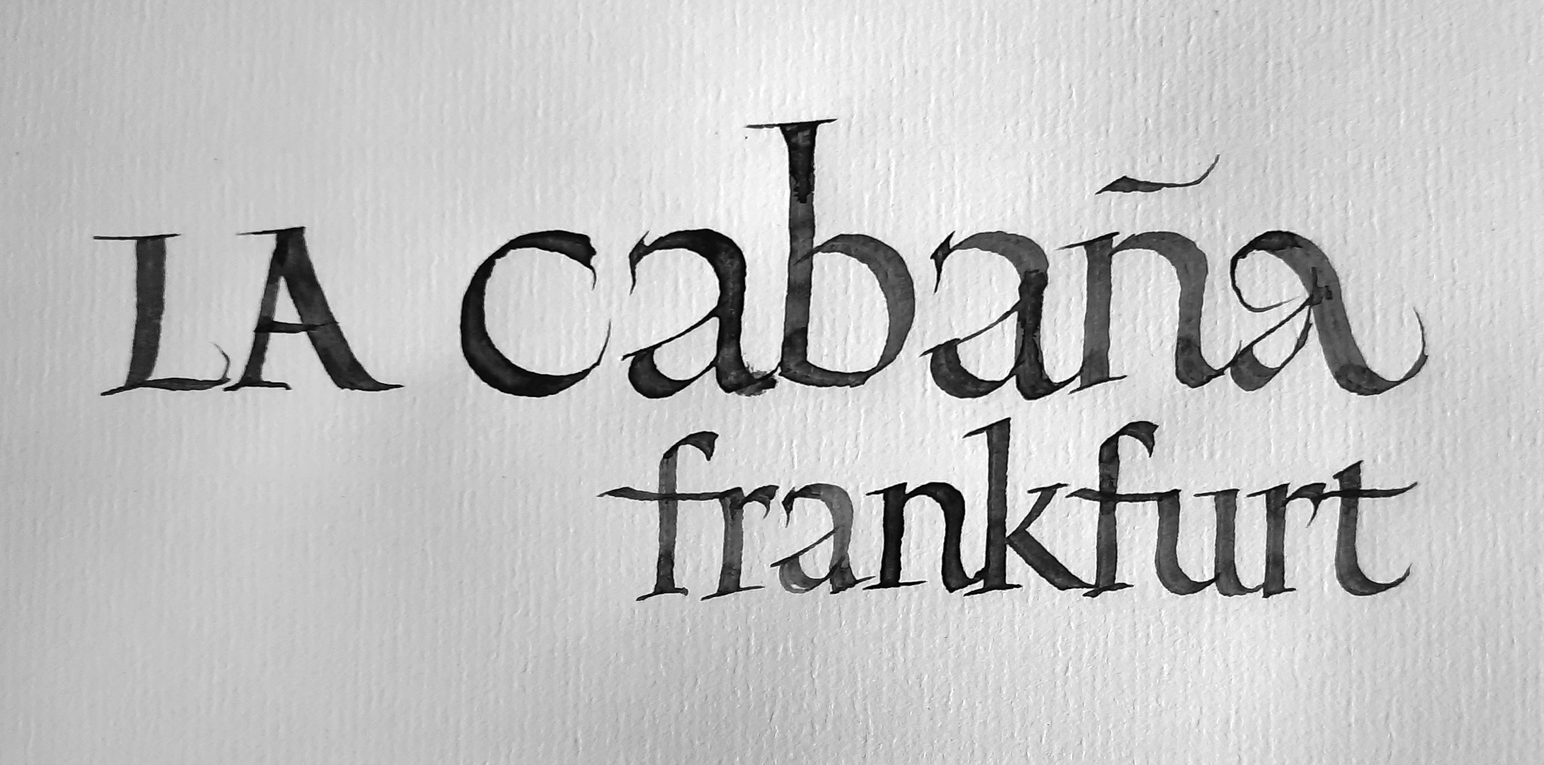
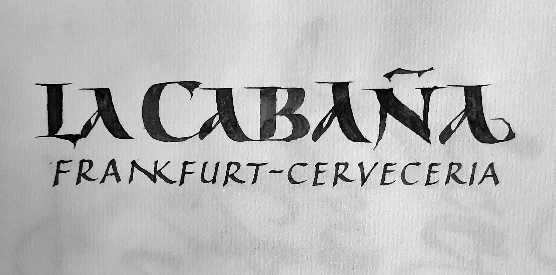
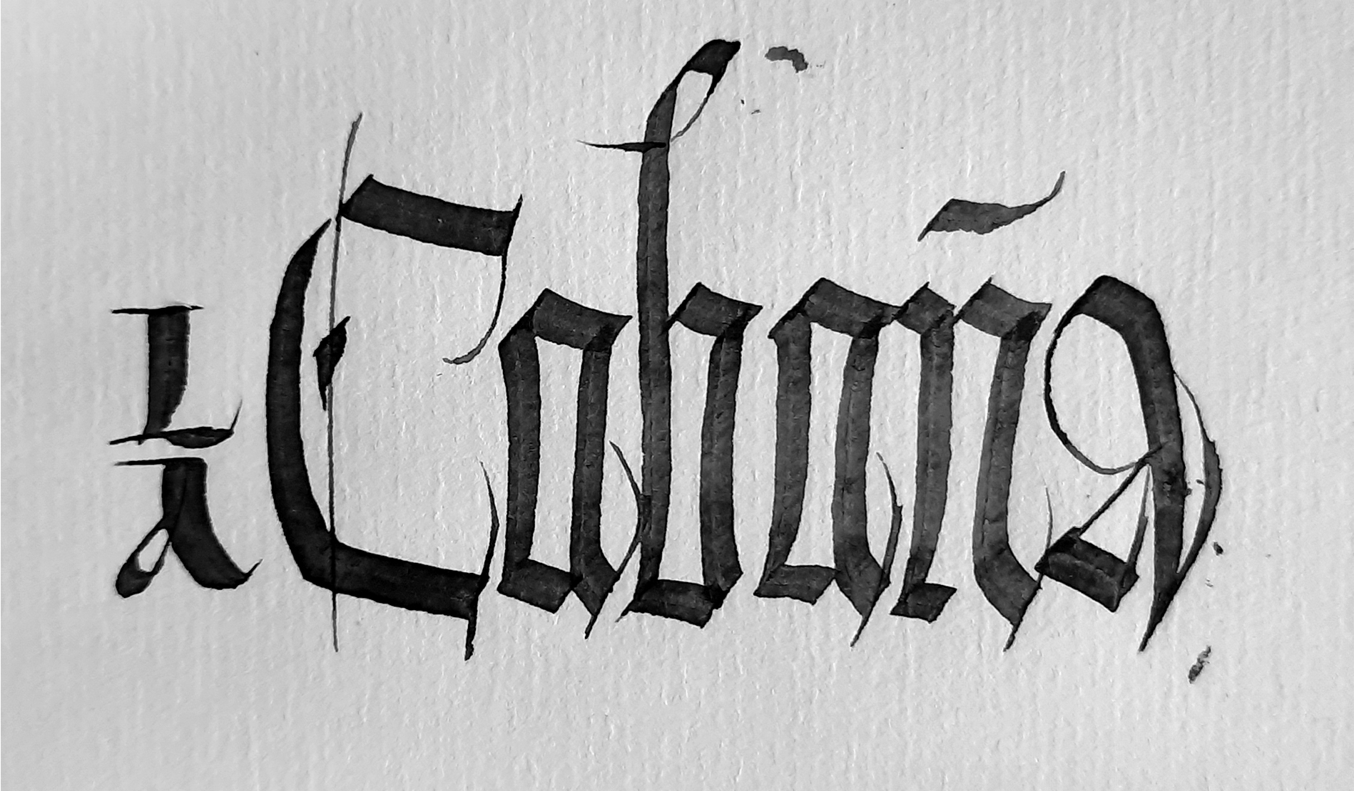
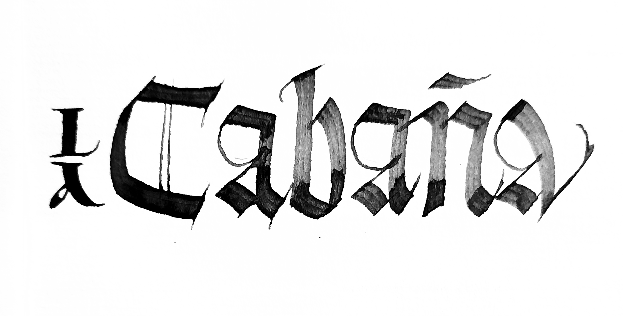
That's why I wanted to maintain the Frankfurt style but refresh it somehow. At first, I tried to see how eliminating clichés would work out, but in the end, I leaned towards Blackletter, which is closely associated with classic Frankfurters.
That's why I wanted to maintain the Frankfurt style but refresh it somehow. At first, I tried to see how eliminating clichés would work out, but in the end, I leaned towards Blackletter, which is closely associated with classic Frankfurters.
<
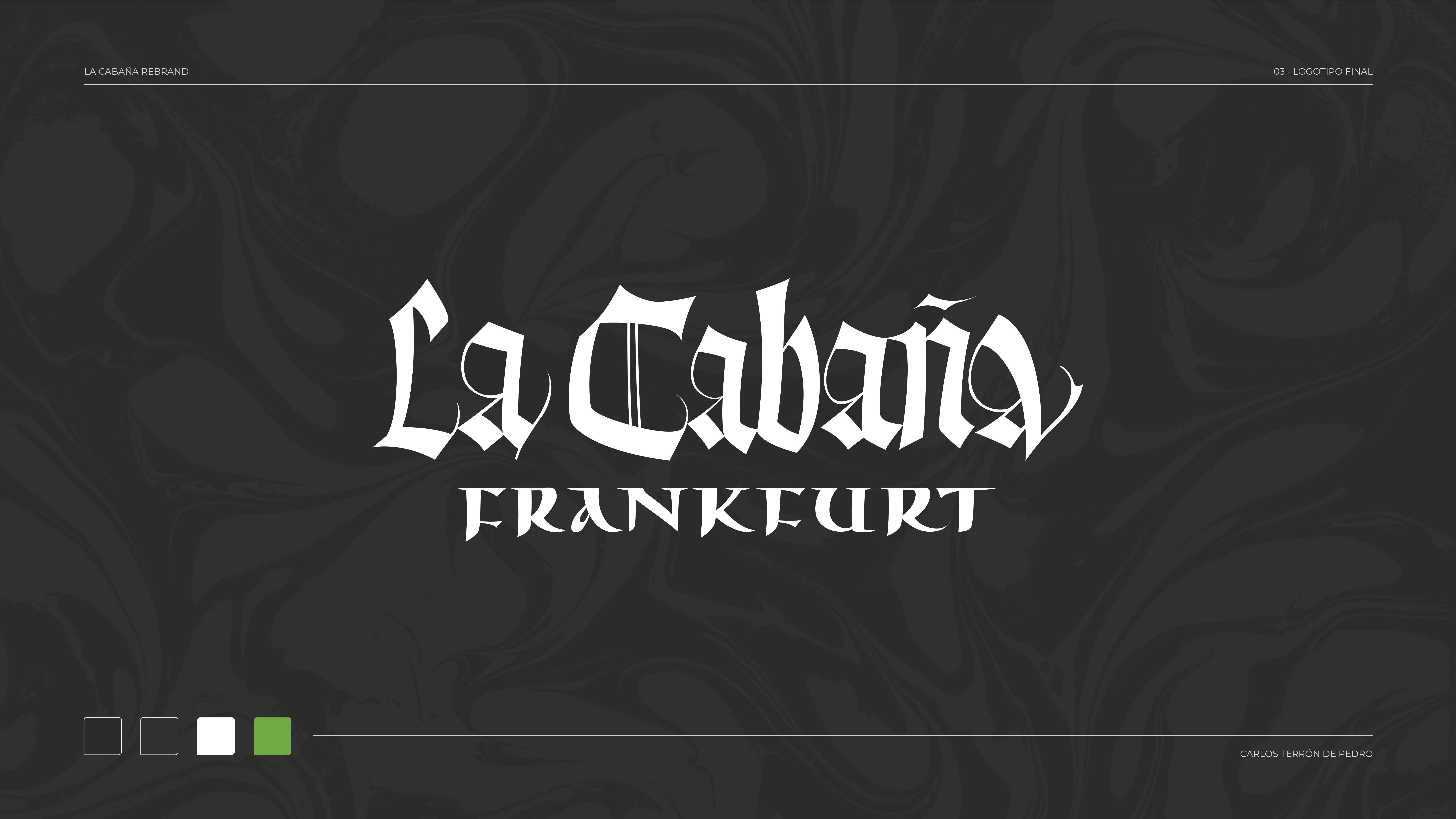
The final artwork is composed of a Koch+rounded Blackletter, complemented by an uncial for 'Frankfurt.' Previously, the logo was arranged the other way around: 'Frankfurt - La Cabaña.' I aimed to emphasize the actual name rather than the type of food they serve (considering they offer more than just Frankfurts).
The final artwork is composed of a Koch+rounded Blackletter, complemented by an uncial for 'Frankfurt.' Previously, the logo was arranged the other way around: 'Frankfurt - La Cabaña.' I aimed to emphasize the actual name rather than the type of food they serve (considering they offer more than just Frankfurts).
